There is no single "best" Python charting library, and anyone who tells you otherwise is selling something. The honest answer is that the field splits into a handful of tools that each win a specific job: a publication-quality static plot, a statistical one-liner, an interactive dashboard, a declarative spec you can version-control, or a chart that has to survive a hundred million points. This review walks the libraries that matter, what each is genuinely good at, where each breaks, and — because this site is about building in Python for markets — how they handle candlesticks and large time series.
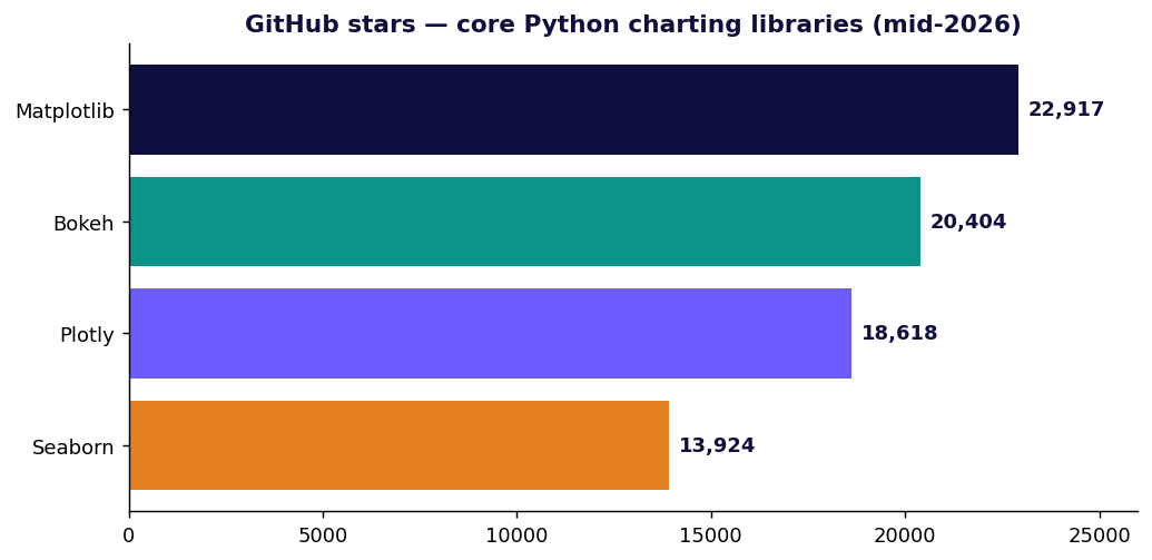
Every star count, download figure and license below was checked against primary sources (GitHub, PyPI, official docs) in mid-2026. Where a number is a vendor's self-reported best case, it's flagged as such.
The mental model: static vs interactive
The first fork is whether the output is a static image (PNG/SVG/PDF, rendered once) or an interactive figure (HTML/JS, pan-zoom-hover in a browser).
- Static: Matplotlib, Seaborn, Plotnine — and Pygal, which outputs interactive-ish SVG.
- Interactive: Plotly, Bokeh, Altair.
The second fork — which only bites once your data gets large — is where the points get drawn: in the browser (client-side, WebGL) or pre-aggregated on the server into an image. That distinction is the whole story of the "scale tier" further down, and it's the one most reviews skip.
Matplotlib — the foundation everything stands on
Matplotlib is the bedrock of Python plotting. It's not just a library; it's the rendering engine that Seaborn, Plotnine's defaults, mplfinance and a dozen others build on top of. Its license is permissive — officially "based on the PSF license" and BSD-compatible, so you can drop it into a proprietary product and sell it without a second thought (license docs).
Strengths. Total control. If you can describe a mark on a 2D canvas, Matplotlib can draw it, and it exports crisp vector PDF/SVG for print. It's installed everywhere and every error you'll ever hit already has a Stack Overflow answer.
Weaknesses. The API is famously two-headed — a MATLAB-style stateful pyplot interface and an object-oriented Figure/Axes interface — and tutorials mix them freely, which is exactly why "why you hate matplotlib" is a genre. Defaults are dated, and styling a chart to look modern takes real lines of code.
import matplotlib.pyplot as plt

fig, ax = plt.subplots(figsize=(10, 4))
ax.plot(df.index, df["close"], lw=1.2)
ax.set_title("BTC-USD daily close")
fig.savefig("btc.png", dpi=150, bbox_inches="tight")
Use it when you need a static, print-ready figure, or you're building a higher-level tool and want a canvas you fully control.
Seaborn — statistical graphics without the boilerplate
Seaborn is a thin, opinionated layer over Matplotlib (BSD-3-Clause) that turns ten lines of axes-wrangling into one. It "provides a high-level interface for drawing attractive statistical graphics" and integrates tightly with pandas — distributions, regressions, heatmaps, and faceted small-multiples are all one call.
import seaborn as sns
sns.set_theme()
sns.lineplot(data=returns, x="date", y="ret", hue="symbol")
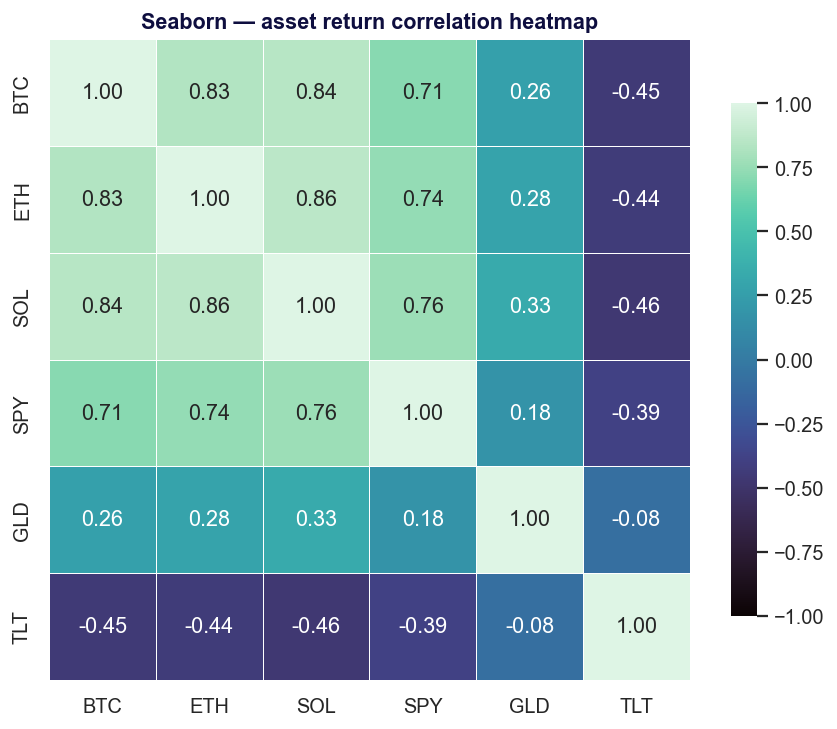
Strengths. Best-in-class statistical defaults; gorgeous out of the box; the obvious first reach for exploratory data analysis.
Weaknesses. It inherits Matplotlib's static nature (no interactivity) and, when you need a chart it doesn't have a function for, you drop back down to raw Matplotlib anyway. It's a convenience layer, not an escape from the engine.
Use it when you're doing EDA on a DataFrame and want correlation heatmaps, distributions or regression plots fast.
Plotly — the interactive default
Plotly.py is the most widely adopted interactive option. It's MIT-licensed, built on top of plotly.js, and the numbers are not close: roughly 18.6k GitHub stars and about 1.24 billion all-time PyPI downloads — on the order of 61 million downloads in the last 30 days (PyPI · download stats). Hover tooltips, zoom, pan and legend-toggling come for free, and the same figure renders in a notebook, a Dash app, or a static HTML file.
import plotly.graph_objects as go

fig = go.Figure(go.Candlestick(
    x=df.index, open=df.open, high=df.high, low=df.low, close=df.close,
))
fig.update_layout(title="BTC-USDT", xaxis_rangeslider_visible=False)
fig.show()
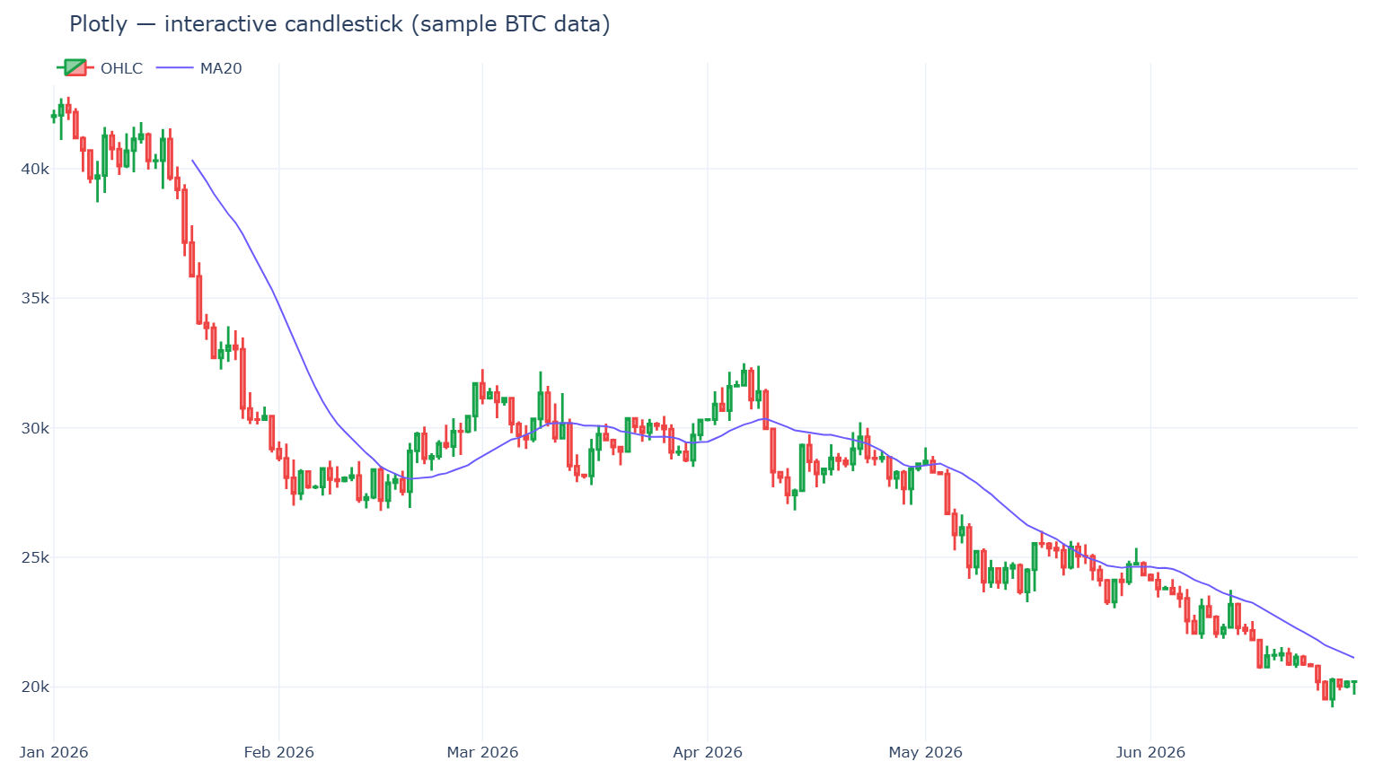
Strengths. Interactivity with zero JavaScript; first-class financial chart types (go.Candlestick, go.Ohlc); the path to a full dashboard (Dash) is short.
Weaknesses. The plotly.js bundle is heavy — a real cost for page-load-sensitive sites (bundle-time analysis). And there's a hard rendering ceiling: with WebGL traces (go.Scattergl) you can represent up to ~1 million points, but browsers allow only 8–16 WebGL contexts per page, so in practice you get 4–8 WebGL figures before you hit "Too many active WebGL contexts" (Plotly performance docs). Smooth interactive zoom/pan realistically holds up to ~100–200k points.
Use it when you want interactive charts or dashboards, especially financial ones, and your series are in the thousands-to-low-millions of points.
Bokeh — interactive built for big and streaming data
Bokeh (BSD-3-Clause, ~20.4k stars / 4.3k forks) is Plotly's main interactive rival, with a different center of gravity: it's "an interactive visualization library for modern web browsers" aimed at large and streaming datasets and server-driven apps (the Bokeh server can push live updates to a chart over a websocket).
One honest caveat the marketing won't give you: "high-performance" is partly self-description. Real-world reports show hover/tooltips bogging down on datasets as small as ~50k points, so it is not automatically fast on huge data — you still reach for aggregation (below). Treat Bokeh's edge as streaming and app architecture, not raw point count.
from bokeh.plotting import figure, show

p = figure(x_axis_type="datetime", title="BTC-USD", height=350)
p.line(df["date"], df["close"])
show(p)
Use it when you're building a live-updating dashboard or a Python-driven data app and want server-side control over interactivity.
Altair — a declarative grammar of graphics
Altair is a declarative library: you describe what to encode (this column to x, that one to color) and the Vega-Lite engine decides how to draw it. Charts are JSON specs, which makes them composable and diff-friendly.
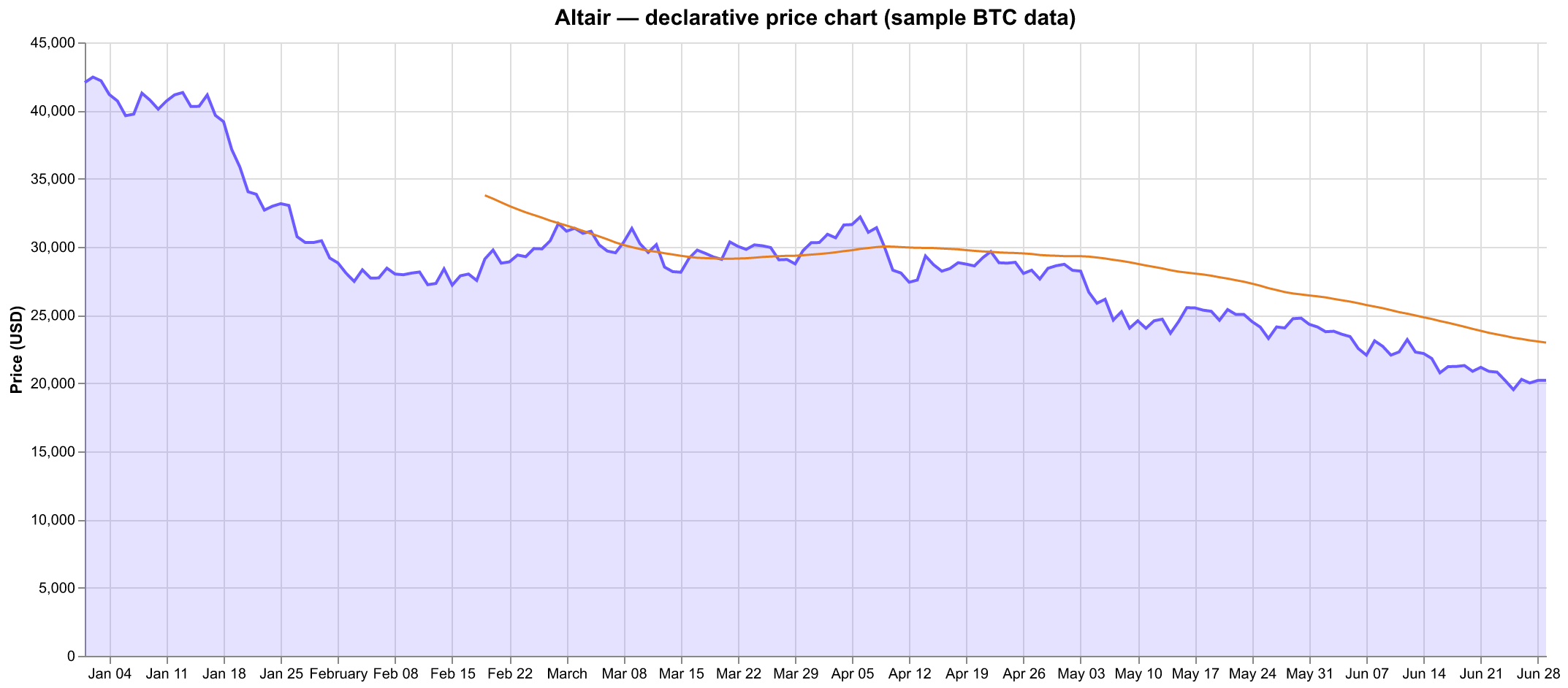
The catch every newcomer hits: by default Altair refuses to plot more than 5,000 rows, raising a MaxRowsError. It's a deliberate guardrail (Altair embeds the data as JSON in the spec), not an inability to handle data — and it's a one-liner to lift:
import altair as alt
alt.data_transformers.disable_max_rows()   # or use the VegaFusion backend for ~100k+

alt.Chart(df).mark_line().encode(x="date:T", y="close:Q")
It's a recurring source of frustration precisely because the error shows up on what feels like a "small" 35k-row frame (large-dataset docs).
Use it when you value concise, declarative, reproducible chart specs and your data is modest — or you're willing to wire up VegaFusion for the bigger frames.
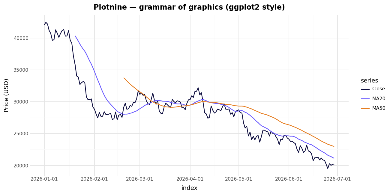
Plotnine and Pygal — rounding out the field
- Plotnine is a near-faithful port of R's
ggplot2grammar of graphics (MIT-licensed). If you came from R or you think inaes()+ layeredgeom_*, it's the most natural API on this list. It renders through Matplotlib, so it's static.
python
  from plotnine import ggplot, aes, geom_line
  (ggplot(df, aes("date", "close")) + geom_line())
- Pygal outputs SVG charts — resolution-independent, stylable with CSS, and tiny to embed in a report or web page. It's a niche pick: lovely for clean vector charts on a webpage, not built for large data or heavy interactivity.
When your data gets big: the scale tier
This is where naive choices fall over. Once you're past a million points, you cannot just hand them to the browser. (To be precise about a myth: browsers can represent ~1M WebGL points — it's interactive smoothness that degrades, not a hard crash.) Two strategies fix this:
1. Server-side rasterization — Datashader. Instead of sending points to the browser, Datashader (BSD-3-Clause) bins them into a fixed-size 2D grid and renders that grid as an image, "faithfully preserving the data's distribution." Its headline figure: a billion points in about a second on a 16 GB laptop, scaling out-of-core and to the GPU via Dask (intro · HoloViews large-data guide). Treat the billion-points-per-second number as a vendor best case — but the approach (re-bin on every zoom/pan) is genuinely the right one for dense data.
import datashader as ds, datashader.transfer_functions as tf

cvs = ds.Canvas(plot_width=900, plot_height=400)
agg = cvs.points(df, "t", "price")     # df can be a Dask frame larger than RAM
img = tf.shade(agg)
2. View-dependent downsampling — plotly-resampler. This keeps Plotly's full interactivity but only ever renders the points you can actually see. Its default MinMaxLTTB aggregation reduces each trace to ~1,000 plotted points for the current view, then re-fetches as you zoom — the demo visualizes over 110 million data points this way (paper).
from plotly_resampler import FigureResampler
import plotly.graph_objects as go

fig = FigureResampler(go.Figure())
fig.add_trace(go.Scattergl(name="price"), hf_x=ts, hf_y=price)  # 100M+ points
fig.show_dash()
Rule of thumb: dense scatter/heatmap of millions of points → Datashader; long interactive time series → plotly-resampler.
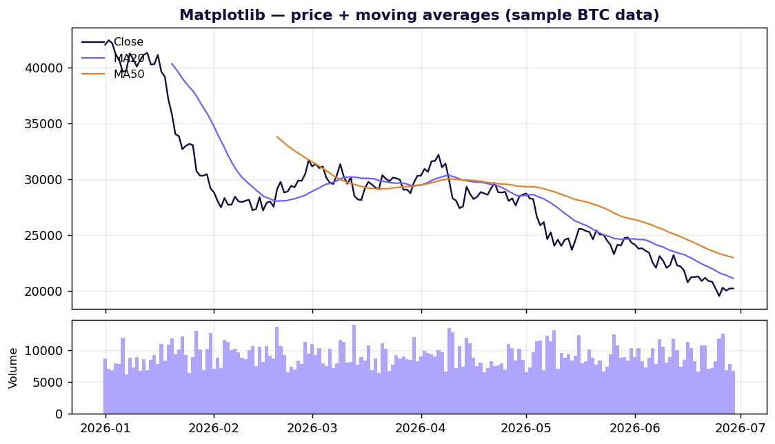
Charting market data: candlesticks and OHLC
For a trading-focused workflow, the standout is mplfinance — the Matplotlib org's financial-charting package. It takes a pandas DataFrame with a DatetimeIndex and Open/High/Low/Close columns and draws candlestick, OHLC, line, Renko and Point & Figure charts, with moving averages and volume baked in:
import mplfinance as mpf
mpf.plot(df, type="candle", mav=(20, 50), volume=True, style="charles")
Beyond mplfinance:
- Interactive candlesticks: Plotly's
go.Candlestick, wrapped inplotly-resampleronce your history runs long. - Live/streaming charts: Bokeh's server model, or dedicated wrappers like
lightweight-charts-python(a binding over TradingView's lightweight-charts) when you want that exact trading-terminal look. - Static reports/backtests: mplfinance straight to PNG.
The comparison at a glance
| Library | Type | License | Interactive | Best for | Watch out for |
|---|---|---|---|---|---|
| Matplotlib | Static | PSF/BSD-compatible | No | Full control, print/PDF | Verbose, dated defaults |
| Seaborn | Static | BSD-3 | No | Statistical EDA | Drops to Matplotlib for the unusual |
| Plotly | Interactive | MIT | Yes | Dashboards, finance charts | Heavy bundle; ~1M-point WebGL ceiling |
| Bokeh | Interactive | BSD-3 | Yes | Streaming / data apps | Not auto-fast on big data |
| Altair | Interactive | BSD-3 | Yes | Declarative, reproducible specs | 5,000-row default cap |
| Plotnine | Static | MIT | No | ggplot2 muscle memory | Static only |
| Pygal | SVG | Open source (LGPL) | Light | Clean vector charts on the web | Niche; not for big data |
| Datashader | Server raster | BSD-3 | Via HoloViews | 10⁶–10⁹ points | An image, not vector marks |
| mplfinance | Static | BSD-style (mpl org) | No | Candlestick / OHLC | Static; pair with Plotly for interactivity |
Popularity figures verified mid-2026: Plotly ≈18.6k stars / ≈1.24B downloads; Bokeh ≈20.4k stars / 4.3k forks. Star and download counts move constantly — treat them as snapshots, and remember raw PyPI downloads include CI and mirrors, so they overstate human adoption.
How to choose, in one breath
- Quick static plot in a notebook → Matplotlib.
- Statistical EDA on a DataFrame → Seaborn.
- Interactive charts or a dashboard → Plotly (or Bokeh if it's streaming / app-shaped).
- Concise, version-controllable specs → Altair (mind the 5k-row cap).
- You think in ggplot2 → Plotnine.
- Clean SVG for a web page or report → Pygal.
- Millions to billions of points → Datashader (dense) or plotly-resampler (long time series).
- Candlesticks and market data → mplfinance for static, Plotly for interactive.
Pick the one that matches the job, not the one with the most stars. Most real projects end up using two or three of these together — Seaborn for exploration, Plotly for the dashboard, mplfinance for the backtest report — and that's the correct outcome, not a failure to standardize.
Methodology: claims in this review were cross-checked against primary sources (project GitHub repos, PyPI, and official documentation) and adversarially verified; figures are mid-2026 snapshots. Performance numbers marked as vendor figures (Datashader's billion-points, plotly-resampler's 110M) are reproducible best cases, not independent benchmarks.